Often, when we want to understand how a process works, we find ourselves faced with a table of data like the one below. In this example, we'd like to see which parameters influence the pH of a swimming pool.
| Pastille supplier | Water temperature | Time between 2 tablets | pH |
|---|---|---|---|
| A | 21.8 | 8.0 | 7.5 |
| A | 21.9 | 5.0 | 7.4 |
| A | 23.4 | 9.0 | 7.4 |
| A | 21.7 | 10.0 | 7.2 |
In other words, a table containing multiple rows, each of which contains information about the measurement you wish to improve (in this case, pH) and the process conditions at the time of manufacture/measurement (in this case, the type of tablet supplier, the water temperature and the time since the last tablet). The difficulty with this type of exercise is how to analyze the data and find out from it how the process works.
????TipDo not merge cells in Excel when constructing this type of table, as this generally complicates analysis after the fact.
Step 1 to analyze your data: Look the table straight in the eye
Our first reaction to this type of picture is often to look it straight in the eye and try to understand from the figures how the process behaves. I'll let you do that, but it's not easy, because our brains aren't made for it. In fact, 70% of our nerve cells are designed to analyze visual information. But a table of figures doesn't contain much visual information, especially numbers that we'll find hard to interpret. So, if we want to form an intuition, we need to quickly move on to step 2.
Step 2 for data analysis: Building graphs
Our brains are visual, so we're going to satisfy them by giving them graphics to look at.
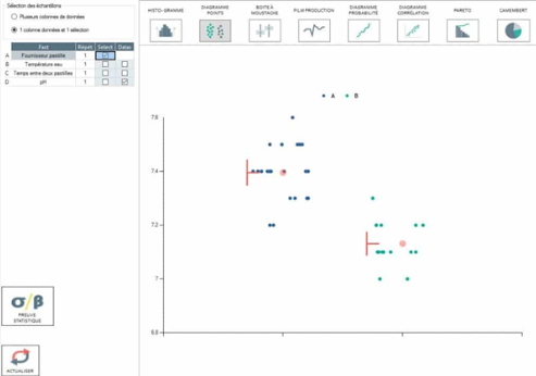
The graph above shows the pH measurements according to the two suppliers A and B. It's immediately clearer, as we can see that the tablet supplier seems to have an influence on the pH of our pool... However, making graphs shouldn't be the ultimate step in our analysis. While it may give our brains an intuition, it doesn't provide proof that the tablet supplier does indeed have an influence on the pool's pH. For this, we need to statistical proof.
Step 3 to analyze your data : Proof with statistical tests
Once you know which graphics are interesting, just ask Ellistat to provide us with statistical proof of our claims by clicking on the "statistical proof" button. The following window appears:
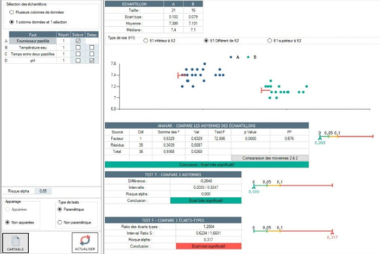
If you read what Ellistat tells us, you can see that the difference in averages (ANAVAR and TEST T tests) is statistically "very significantly different". This is proof of the supplier's influence. It's no longer intuition, but proof.
Step 4 to analyze your data: Model the process
Perfect, we've shown the influence of the tablet supplier. But can we go further? Well, yes, by trying to model the process. Instead of analyzing columns one by one, we'll try to analyze multiple columns at once, using multiple regression. The result is as follows:
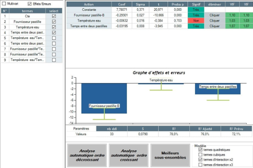
Using multiple regression, we see not only that the influence of the lozenge supplier is statistically significant (Read the Signif column), but we also see that the time since the last lozenge is also influential. And all this in a single study - it's almost magical.
To take it a step further, simply go to the forecasting tab and you'll be able to predict the pH of your pool according to the type of supplier, the time between two tablets and the water temperature:
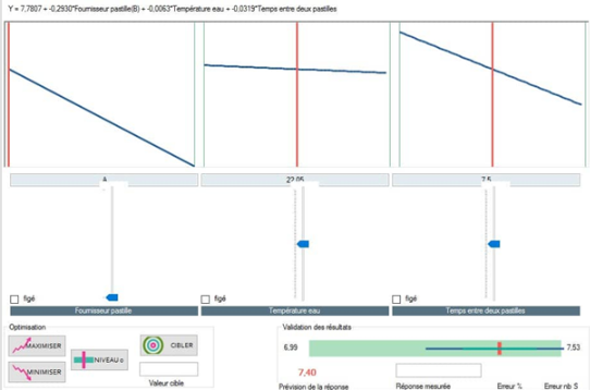
Thus, using supplier A and a time between two tablets of 7.5 days, we predict an average pH of 7.4.
Conclusion
Analyzing a data table isn't all that complicated. All you need to do is master the last 3 steps in this article to understand how your processes work. To help you in this process, Ellistat guides you through the study so that you don't have to worry about statistical calculations, but concentrate on understanding the physical phenomena involved.

