Ellistat Data Analysis offers the Correlation submenu, which contains several statistical tools. These tools can be used to perform correlation studies of multiple responses in a dataset. Or to reduce the size of a dataset or monitor processes with several variables simultaneously.
In the examples below we present the tools:
- Correlation matrix
- ACP
- T² card
The dataset used in these examples can be found on the following page.
Independent Data 🇺🇸/ Données indépendantes🇫🇷
Example 1: Find the correlation between several Y responses, using the correlation matrix
Visit correlation matrix is an essential statistical tool used to understand the relationships between several variables in a data set.
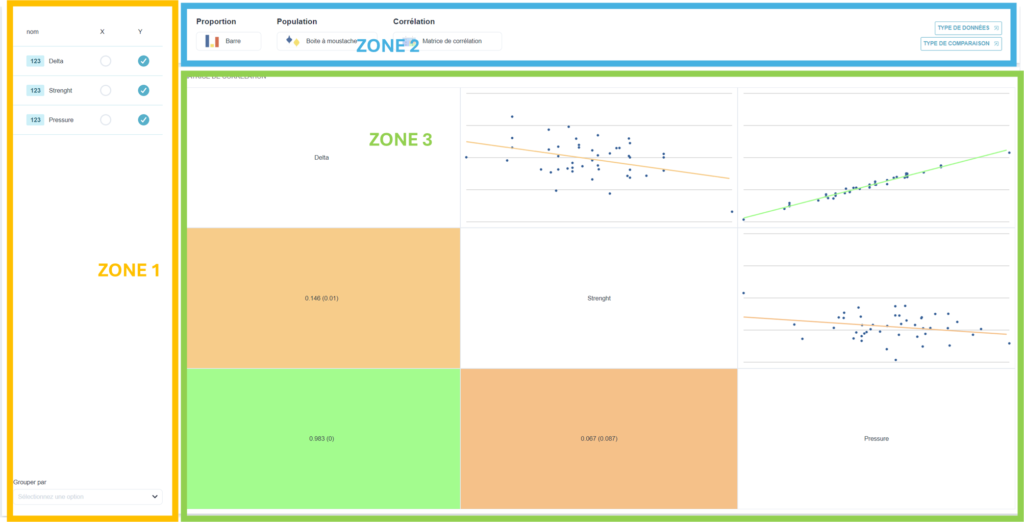
- Place quantitative data from several Y columns in the grid. In the example, we want to find the correlation between responses Y1="Delta", Y2="Force" and Y3="Pressure".
- Click on the "Inferential statistics".
- In the zone 1Select the Y columns Y1="Delta", Y2="Force" and Y3="Pressure".
- In zone 2, select your data type. By default, if the selected columns contain quantitative values, Ellistat will plot the correlation curves between all the responses in pairs. In addition to the Correlation sub-menu, you can also choose the "Proportion" or "Population" sub-menus. 📝: select "Correlation matrix".
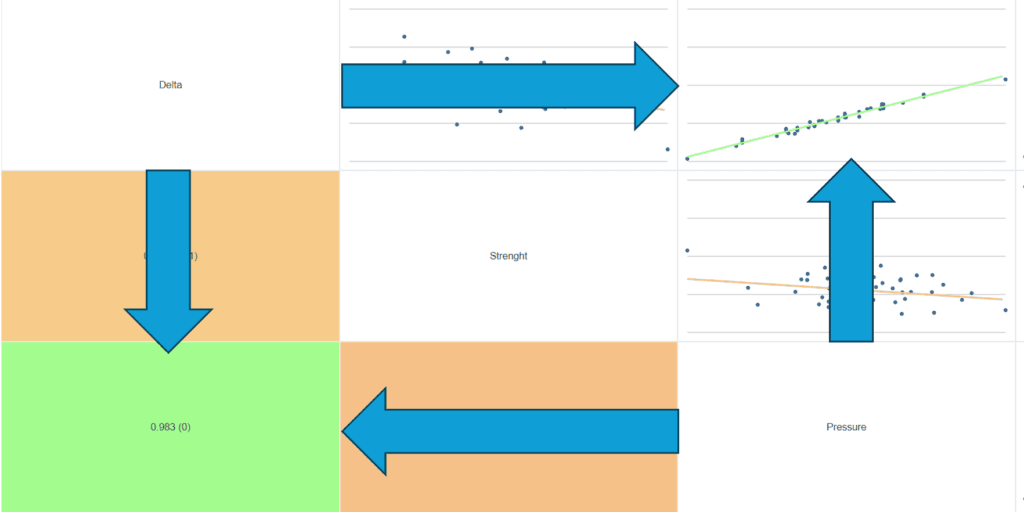
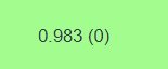
- In zone 3In the half above the diagonal, we obtain the correlation matrix containing all the correlation graphs of two answers in pairs. The diagonal of this matrix shows the names of the answers. And in the lower half we find the coefficients of determination R² and the significance level (P-value).
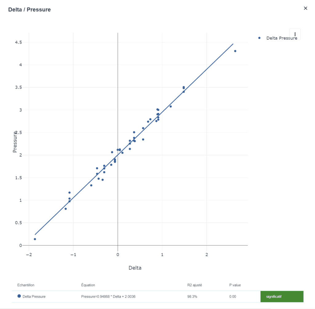
The diagram below shows the correlation graph, R² and P-value for both Delta and Pressure responses.
💡 When you click on a graph, you'll find a report of an XY Analysis of the two correlated responses:
💡 In the lower half of the correlation matrix there are two values :
R² (P-value).
Example 2: Find the correlation between several Y variables, using PCA.
Principal Component Analysis (PCA) is a statistical method used to reduce the dimensionality of a dataset while retaining as much information as possible. This technique is particularly useful when working with multivariate data (i.e. data containing several variables).
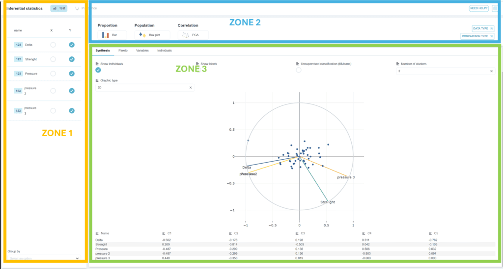
- Place a set of quantitative data with several Y columns in the grid. In the example, we want to perform a PCA analysis on the data: Y1="Delta", Y2="force", Y3="Pressure", Y4="Pressure 2", Y5="Pressure 3".
- Click on the "Inferential statistics".
- In the zone 1Select the Y columns Y1="Delta", Y2="Force" and Y3="Pressure", Y4="Pressure 2", Y5="Pressure 3".
- In zone 2, select your data type. Press the "correlation" sub-menu and select "correlation".ACP". In addition to this sub-menu, you can also select the "Proportion" or "Population" sub-menus. 📝: select "ACP"
- In zone 3we obtain the projection of the various responses in the plane composed of the principal vectors C1 (x-axis) and C2 (ordinate).
💡 In the upper part of the zone 3There are two tools used to select one of the spreadsheet factors:
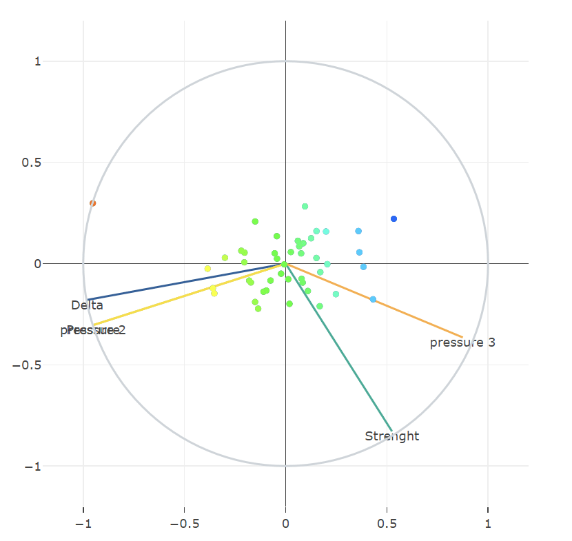
With the "Label" tool :
It is possible to see the variation of individuals according to the chosen factor. This would make it possible to color-code individuals according to the chosen variable. The following case study shows the results obtained for the label = "Delta". We can see that individuals with a strong delta are in orange/yellow. The individuals with a low delta are in blue.

The "other variable" tool
It is used to plot a factor without taking it into account when determining the main vectors. Please note! For this feature to work, the factor must not be ticked in zones 1 and 3 at the same time. It must only be ticked in zone 3. Here, the example of the "Delta" factor (see figure below). This variable can be either a quantitative or a qualitative variable.
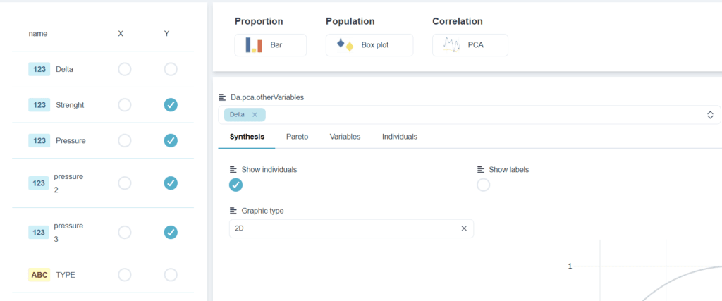
Whether you choose the "Label" option or the "Other variable" option, the variables selected can be quantitative or qualitative.
💡 In the middle part of the zone 3you can select several tabs:

The "Summary" tab:
This tab contains the graph, menus for displaying individuals in the graph, classification settings and the table of main vectors.
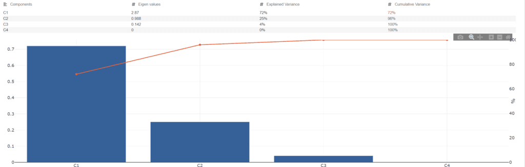
Pareto tab:
This tab shows the Pareto diagram, which expresses the contribution of each main vector.
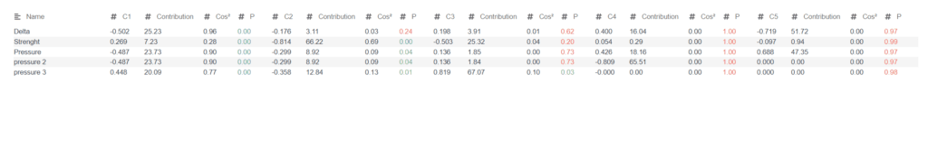
The "variable" tab:
This tab shows the degree of correlation significance between the variables and the various main axes (C1, C2,...). A P-value<0.05 means that the correlation between the variable and the main vector is significant. (see table below)
Individual values" tab:
This tab shows the coordinates of individuals in the space of principal vectors.
Example 3: Hotelling's T² card
Hotelling's T² chart is a statistical tool used to calculate multivariate quality control and data analysis. They enable processes with several variables to be monitored simultaneously. It is a multivariate extension of Shewhart control charts, which focus on a single variable. Hotelling's T² is often used in contexts where several quality characteristics need to be monitored at the same time. Examples include manufacturing, biology and engineering.
- Place quantitative data from several Y columns in the grid. In the example, we want to monitor the following data simultaneously: Y1="Delta", Y2="Force", Y3="Pressure", Y4="Pressure 2", Y5="Pressure 3".
- Click on the "Inferential statistics".
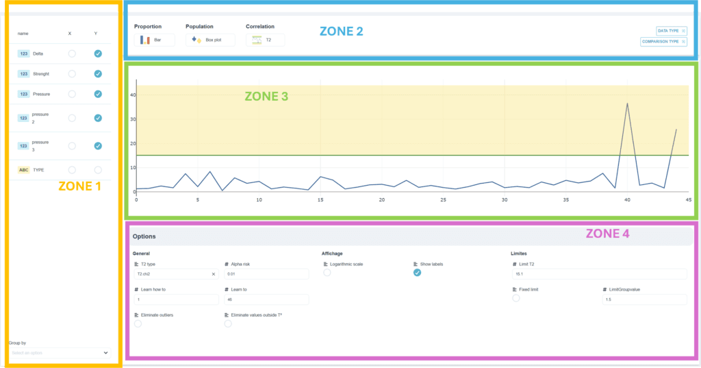
- In the zone 1Select the Y columns Y1="Delta", Y2="Force" and Y3="Pressure", Y4="Pressure 2", Y5="Pressure 3".
- In zone 2, select your data type. Press the "correlation" sub-menu and select "correlation".T²". In addition to this sub-menu, you can also select the "Proportion" or "Population" sub-menus. 📝: select "T²"
- In zone 3we obtain the control chart T² with individual values and control limits.
- In the zone 4Here you'll find options such as general map settings, display options and control limit calculation.
💡 In the middle part of the zone 4Several options can be set:
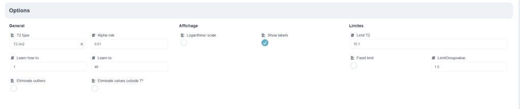
- "GeneralWith this option, you can choose the type of control chart calculation (classic, Sullivan and Chi-2). You can also choose the alpha risk level and determine the data for training.
- "Display : With this option, you can transform the ordinate into a logarithmic scale and apply a Label to the data.
- "Limits With this option, you can change the control limit by setting it manually.