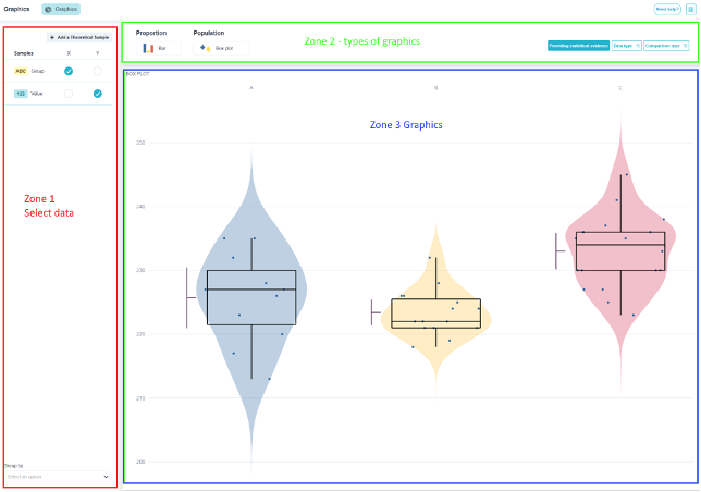
The Charts menu has a special feature that you need to understand before using it: It doesn't offer all types of charts; it offers the ones that make sense for the selected data.. Selecting a qualitative variable displays the pie chart and hides the histogram; adding a second quantitative variable displays the XY scatter plot.
This isn't a limitation; it's a safeguard: a histogram of defect codes or a correlation matrix across modalities is meaningless. The menu prevents you from generating them.
Click on the «Data Analysis» menu, then click on «Charts.».