


This is the main entry: it applies a lifespan rule to your data.
Select the input format
Five formats, depending on the actual format of your data. That's the first decision you need to make.
| Format | Table Structure | Use Cases |
| Periods and Censorship | Start of period, end of period, number of failures, number of censored observations | Data Already Aggregated by Interval |
| Values and Censorship | Uptime, Outages, Numbers | Laboratory Tests |
| Sale and Return Dates | Date of sale, date of return, numbers, censorship | Item-by-Item Traceability |
| Date of Sale and Downtime | Date of sale, uptime, numbers, censorship | A variation on the previous one, useful for cars, where we think in terms of kilometers rather than time |
💡 Don't convert your data to fit a specific format—choose the format that matches what you have. Every manual conversion is an opportunity to lose data.
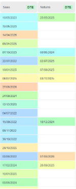
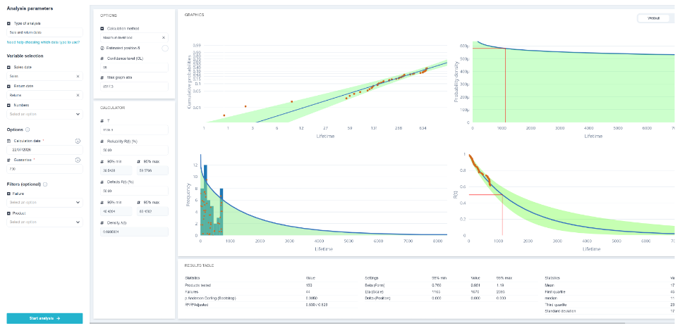
Adjust the analysis
- Type of Analysis : 2- or 3-parameter Weibull, Kaplan-Meier; ;
- Calculation method : maximum likelihood or regression ;
- Confidence Level of the interval; ;
- Maximum x-coordinate of the graphs, to adjust the display.
💡 Plausibility or regression? Maximum likelihood is statistically more efficient and handles censoring better; it is the default choice. Regression, which fits a straight line to the Weibull plot, is more visual and makes it easier to explain the results to others. On actual data, the two methods converge; if they diverge significantly, it is a sign that the distribution is a poor fit.
Kaplan-Meier
Kaplan-Meier does not adjust no law : It constructs the observed survival curve, step by step, taking censoring into account.
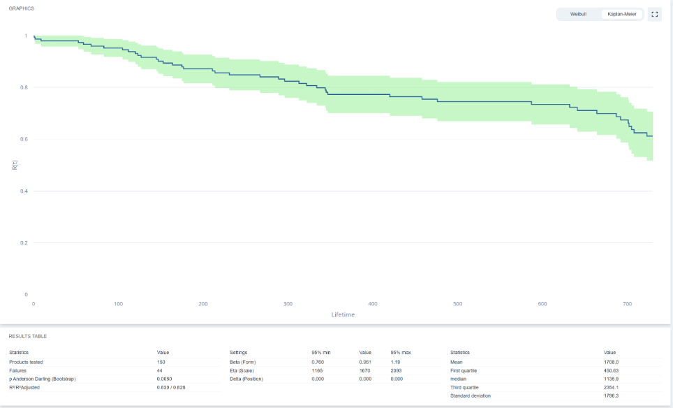
- Use Weibull when we want to extrapolate, make a 5-year forecast based on 1 year of historical data, or obtain an interpretable β.
- Use Kaplan-Meier when we want to describe something without making assumptions, or when the shape of the curve is clearly irregular.
Visit Kaplan-Meier survival comparison compares two groups: two suppliers, two versions, two usage conditions. It’s the right tool for answering the question, «Does the new version hold up better than the old one?».
View the results
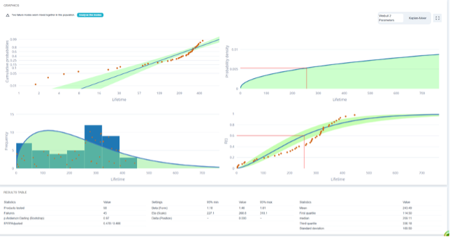
The Weibull paper aligns the data points if the model fits well. A distinct curvature suggests trying a 3-parameter Weibull model, or indicates a mixture of two failure modes.
The hazard graph shows the evolution of the failure rate over time; the direct reading of the regime is described by β.
⚠️ Mixing two failure modes in the same dataset results in a poor fit and an intermediate β that describes neither one nor the other. If you know the failure modes, Separate the data before adjusting it. A β of 1.2 may mask a β of 0.6 for infant mortality plus a β of 3 for wear and tear.
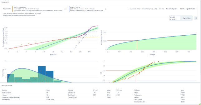
Ellistat automatically detects this scenario and suggests fitting a two-mode model, without the need to separate the data beforehand. There are two ways to model this, depending on the product’s physics:
- Mixture : The population consists of two distinct subpopulations, each following its own Weibull distribution. A proportion p of the products is affected by the first mode, and the rest by the second. This is the case for a batch that is partially affected by a manufacturing defect: the defect-free products will never fail in this mode.
- Overlap: Each product is simultaneously subject to both mechanisms and fails due to whichever of the two occurs first (concurrent risks). This is the case for a product that experiences both gradual wear and accidental failure.
💡 The choice is based on what we know about the product, not on the quality of the fit: the two models often produce similar curves based on the observed data, but very different extrapolations. When combined, the healthy subpopulation boosts long-term reliability; when overlaid, the two risks continue to add up. If the modes are known and identifiable in the data, separating the datasets remains the clearest interpretation.
Ellistat flags cases where analysis is not possible: *«No failures available for Weibull analysis with this selection»*—if no failures have been observed, no distribution can be fitted.