


This is the most recent page in the menu, and it works differently from all the others: We don't calculate the number of trials; we select it from a curve.
The Principle: Ellistat Data Analysis takes on board a catalog of certified plans, approximately 1,000 designs, ranging from 3 to 14 factors and from 8 to 44 runs, whose properties are mathematically proven and re-verified with each software release: main effects that are orthogonal to one another, and completely alias-free using squares and interactions. The sources are academic: conference matrices and DSDs from Jones & Nachtsheim (2011), mixed designs by Núñez Ares, Schoen & Goos (2023), designs published in *Technometrics* (2020), supplemented by designs generated by Ellistat.
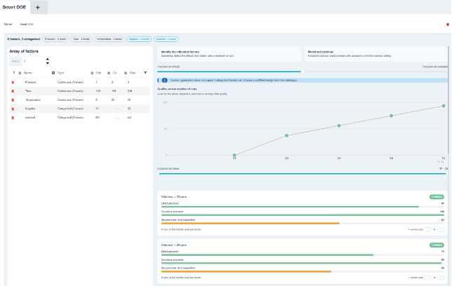
1. The Table of Factors
Each factor receives a Type :
- Continuous (3 levels) : min, intermediate, max. Its curvature is estimable; ;
- Age-Group (2 levels): two options, no intermediate level. The field for the central level is disabled: «A categorical factor has only two options: no intermediate level to enter.»
A banner summarizes the setup: « n factors, including k »category(ies)" with one bullet point per factor. You need to at least two continuous factors so that routes can be suggested; otherwise, the page displays the message «At least two continuous factors are required to suggest routes.».
2. The Goal and the Compromise
Two exclusive, optional cards:
- Identify the influencing factors : screening: identifying the effects that matter, with a minimum number of trials; ;
- Modeling and Optimization : response surface: build a model with curvature to find the optimal setting.
Below the cards, a slider Accuracy of Effects ↔ Accuracy of Curvature weights the ranking of the plans. In screening mode, it disappears: looking for curvature doesn't make sense when you're only trying to determine which factors matter.
The target is saved in the map: it persists even after the page is reloaded.
3. The Line Between Quality and Testing
This is the main chart: the quality of the best available plan, based on the number of attempts. One dot per map size, connected by a line.
| Point | Meaning |
| Green | Certified floor plan from the catalog. Click to view details. |
| Blue | Customized, optimized plan, already generated. |
| Gray | No certified plan at this scale—click to create one. |
The « Test range explored »narrows the scale. It starts from the mathematical minimum, 2k+1 tests for k factors, and covers at least 3k trials without ever exceeding 60.
💡 The note below the title explains the correct way to interpret this graph: « Look for the elbow : Beyond that, each additional attempt adds little value. » This is exactly the trade-off we usually make blindly, by simply copying the scope of the previous project. Here, it’s quantified: we can see what the five tests we’re hesitating to fund will cost, and what they’ll yield.
4. Map sheets
Below the border, one map per page, sorted by quality. Each map includes:
- a badge : «Certified» (proven orthogonality and absence of aliasing) or «Custom-Optimized» (designed through optimization for this exact size); ;
- three bars from 0 to 100, interpreted like a traffic light:
| Bar | What it measures |
| Clarification of the Effects | The higher the bar, the more accurately the main effects are estimated. |
| Curvature Accuracy | Ability to estimate quadratic terms, and thus to identify an optimum. Displays «cannot be estimated» when the plane does not allow it. |
| Separation of Second-Order Terms | The higher the bar, the less the squares and interactions overlap with one another. |
- the number of exercises already at the intermediate level, and a step-by-step guide « + key points » (up to 6) to add more.
⚠️ The key points are impossible as soon as a factor is categorical : A central point fixes all factors at their intermediate levels, but a categorical factor does not have one. The step-by-step feature is then disabled, with an explanation provided in a tooltip. This is not an interface limitation: such an attempt would render the design unreadable.
5. A detailed map
One click opens a sidebar that contains:
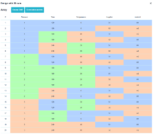
- Visit test matrix in actual values, using the «Create Design of Experiments» button—the same component and the same behavior as on the other pages; ;
- Visit raw metrics : variance of linear effects, variance of quadratic terms, maximum second-order correlation, zeros per column, origin of the plane, catalog ID, and academic reference; ;
- Visit Correlation map of the second-order model : main effects, followed by the squares of the three-level factors, followed by interactions.
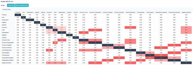
💡 This correlation chart is the central point of the page, and it takes just a second to read: «The boxed section shows the main effects: It must remain white outside the diagonal. »This is visual proof that your results are estimated without second-order contamination, something that no conventional fractional table of comparable size can guarantee.".
6. Custom Generation
When no certified plan exists at the desired size, the gray dot on the border triggers a optimizer who is constructing one. A progress bar appears, which can be canceled; the resulting map is added to the border in blue and remains saved in the experiment map.