


1. The Machine Learning Model and Its Matrix
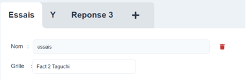
A project contains as many as models as needed, displayed as tabs at the top of the page, with a «+» to create a new one. Each template has a name and refers to the grid that he operates, chosen specifically under his name.
⚠️ Changing a template's grid resets its X, Y, and test lines. This is by design: the columns in a different grid do not have to match. To compare two datasets, create two models.
2. Select the X and Y
The table on the left lists the columns in the grid, along with two columns of checkboxes, X and Y.
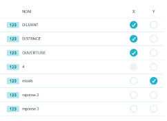
- Y is the answer to predict. Check it Name the model according to her, and chooses the type of model right from the start : linear regression if Y is quantitative, logistic regression if it is qualitative.
- X are the explanatory factors.
Three selection rules you should know:
- a column constant cannot be X: its checkbox is disabled because, without variation, no effect can be estimated; ;
- only the columns in Rehearsal 1 are offered in X; ;
- A single column cannot be both X and Y: selecting one deselects the other.
3. Choose the type of template
The list of types depends on the nature of Y.
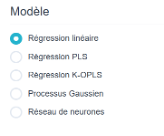
Quantitative Y
| Type | What It Offers |
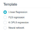
| Linear Regression | The reference model: interpretable coefficients, p-values, R². This is the one we use for understand. |
| PLS Regression | For a large number of interrelated X variables, where classical regression becomes unstable. |
| K-OPLS Regression | Kernel version of the PLS: captures nonlinear relationships. |
| Gaussian process | Smooth interpolation with confidence interval at every point. Excellent performance with limited data. |
| Neural network | Multilayer perceptron: highly nonlinear relationships, at the expense of interpretability. |
Qualitative Y = We no longer predict a value, but rather a class :
| Type | What It Offers |
| Logistic regression | Coefficients and p-values, as in linear regression. The baseline model for classification. |
| Decision Tree | Clear rules that can be directly translated into workshop instructions. |
| Random Forest | Set of trees: more precise, less readable. |
| (SVM) Support Vector Machine | Complex separation boundaries. |
| (KNN) K's closest neighbors | Classification based on similarity to known cases. |
Two types disappear on their own when they aren't applied:
- the Gaussian process requires X all quantitative and at most 50 lines As the learning process progresses, the computational cost skyrockets; ;
- the K-OPLS regression disappears in large tables (when there are more than 2,000 values in the selected columns).
💡 Get Started always using linear or logistic regression, even if nonlinearity is suspected. It provides p-values, an R² value, and interpretable coefficients: enough to determine which These factors matter. More flexible models sometimes make better predictions, but they do not answer the question, «What should we do about it?».
4. Options
Under the model type, the section Options displays the settings specific to the selected type (maximum depth and minimum number of nodes per leaf for a tree, number of trees and proportion of variables for a forest, gamma and cost for an SVM, learning rate, number of epochs, regularization, and hidden layer size for a neural network, and number of components for PLS).
⚠️ These settings have reasonable default values. Changing them haphazardly can lead to over-adjust : a model that perfectly replicates the training data but makes mistakes on any new part. This is the tab Model/Observation and the test lines that tell you whether you won or lost.
5. The Terms of the Template
In a regression analysis, the tab Coefficients It doesn't just read the template: that's where we composes. A term selector allows you to add the following to the main effects:
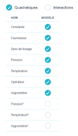
- the quadratic terms : the square of a factor, to account for variability. This applies only to quantitative factors with more than two levels: for factors with two levels, a squared term is indistinguishable from the constant; ;
- the interactions : the product of two factors; ;
- the constant, which can be removed from the model if necessary.
The coefficient table lists, term by term: the coefficient, the’standard error, the statistics, the p-value, the conclusion significant and the VIF. Above that are the model's standard error, the n (ddl)the R² and the Adjusted R², as well as the right side of the model, the complete equation, ready to copy.
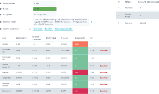
💡 The VIF is the safeguard we tend to overlook. It measures the extent to which a term overlaps with others. A high VIF indicates that the reported coefficient is unreliable—not because the factor has no effect, but because the data do not allow us to distinguish its effect from that of another factor. This is common with observational data; in a well-designed experimental design, it should not occur.
You can delete a term either by removing it from the model's term table or by clicking «Delete.»
Automatic Analysis offers two strategies for selecting terms:
- Moving Forward : Start with the empty model and add the relevant terms one by one; ;
- Back : Start with the complete model and remove unnecessary terms.
The button Best subset goes a step further: it lists the combinations of terms up to a maximum number of terms that you set displays the number of regressions what this represents, and ranks the results by R² and adjusted R². Each candidate can apply with a single click.
⚠️ Automatic term selection invalidates the p-values Strictly speaking: we tested many models and selected the best one, which the p-value calculation does not take into account. The result remains an excellent starting point, but a model obtained in this way is confirms based on new data, not on the ones used to select him.
In the case of qualitative factors, you can select the reference category (included in the constant). The reference category does not appear in the Student's table.
6. Read the results
The right side of the screen displays the results in tabs. The first ones depend on the model; the rest are always there.
Model-Specific Tabs
| Tab | When it appears |
| Taguchi | Ellistat has identified a Taguchi design in the data, and Y is a quantitative variable. Display the analysis specific to this design. |
| Multilevel | The data lend themselves to this: effects and significance of the terms on multilevel factors. |
| Coefficients | Linear or logistic regression (see §5). |
| Configuration | PLS, K-OPLS, Gaussian process, neural network, tree, forest, SVM, KNN — type-specific diagnostics. |
Common Tabs
| Tab | What it shows |
| Model/Observation | Predicted vs. observed. On a qualitative Y-axis, this is the confusion matrix. |
| Histogram | The distribution, on quantitative Y. |
| Residues | Line-by-line details: observed value, prediction, difference, and which test set each data point belongs to. |
| Forecast | Enter values for X and read the predicted response. |
| 3D | As soon as 2 X : the model's response surface. |
| 5D | As soon as 4 X : the same interpretation, with two additional elements conveyed through color and size. |
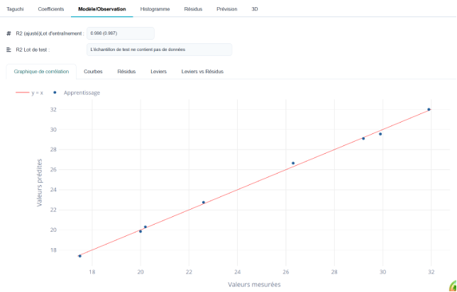
💡 "Model/Observation" is the only tab that evaluates the model. The points must line up along the diagonal, and most importantly The test lines must align with them as well. A model that perfectly predicts its training data but fails on the test set hasn’t learned anything—it has merely memorized the data. That’s the only error that matters, and R² doesn’t account for it.
7. Taguchi
In the case of a 2-level experimental design, the Taguchi table provides the effect plots for all columns in the table.
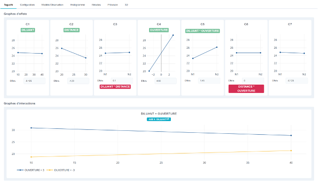
Select or deselect an interaction. Clicking on the name of a red interaction selects it, and it turns green. Similarly, clicking on the name of a green interaction turns it red. Selecting an interaction displays the corresponding interaction graph. You can change the x-axis by clicking on the blue dot.
8. Model / Observation
This graph illustrates the fit between the model and the observed data in various ways. The closer the data points are to the line, the better the model fits the data.
A very useful chart is the Leverage vs. Residuals chart. The points should be in the green.
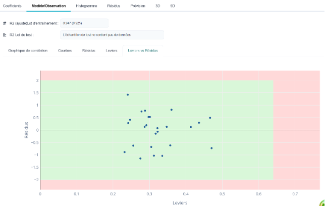
If a data point is in the red—either below or above the line—it's due to an issue with the response. One of the responses doesn't fit the model (outlier?).
If a data point is in the red on the right side, then the problem lies with the X values. One of the test lines is atypical compared to the others (for example, X ranges from 5 to 10 across all lines except one, where X = 20).
9. Histogram of Residuals
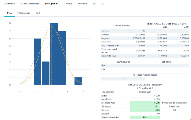
Provide the histogram and the normality test for the residuals
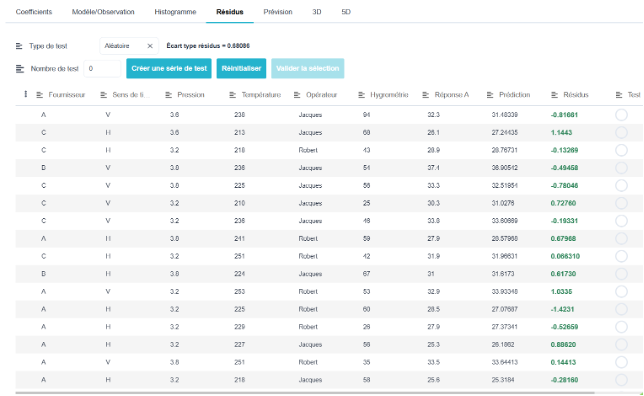
This tab contains a table with the measured values, predicted values, and residual values.
But in this table, you can choose to either randomly select a portion of the rows for testing, or select the first ones, the last ones, or select rows from the "Test" column.
10. Forecast
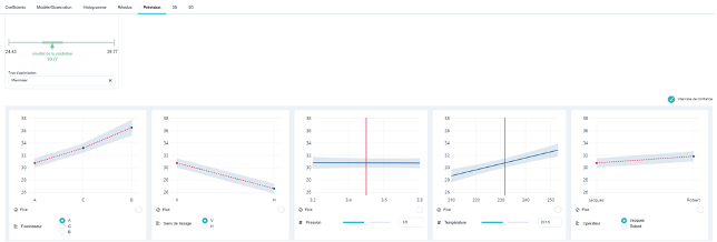
This tab allows you to predict a response and its confidence interval based on the model for any configuration.
11. 3D and 5D Graphics
The 3D menu provides a 3D view of the response surface. Select 2 Xs and a specific configuration of the other Xs to display the visualization.
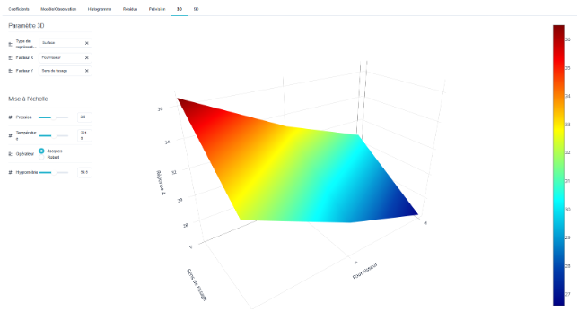
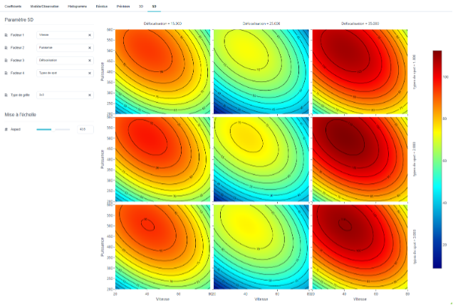
If there are enough X factors, the 5D view is offered, which allows you to see Y as a function of 4X in a single figure (5 dimensions)
The example below shows the power-versus-speed curve for 9 defocus/spot configurations. You can also use a 5×5 grid instead of a 3×3 grid for greater precision.
12. Other Possible Models Using Quantitative Ys
PLS regression
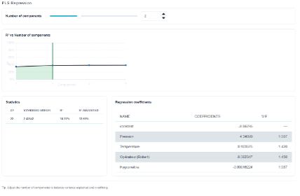
PLS regression is used when there are many independent variables (X) that are correlated with one another: instead of estimating one coefficient per factor, as in traditional regression, it constructs components—combinations of X—and performs regression of Y on these components. The “Number of components” slider sets the number of components; this is the only setting that actually determines the model’s structure.
The R² vs. Number of Components graph guides this choice: we select the number of components at which the curve flattens out. In this example, increasing the number of components from 2 to 4 adds almost no value — the model is selected with 2 components, with an R² of 38.27 % and an adjusted R² of 32.65 % for 22 degrees of freedom and a standard error of 2.42842.
The "Regression Coefficients" table shows, as in linear regression, the constant and a coefficient for each factor (Pressure, Temperature, Operator (Robert), Humidity), along with its VIF. Here, the VIFs remain close to 1, indicating that the factors are not redundant.
⚠️ Adding components always increases the training R²: this is a direct path to overfitting. The optimal number of components is determined by examining the test lines and the Model/Observation tab, not by the R².
KOPLS Regression
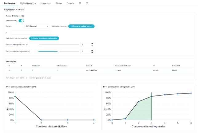
K-OPLS regression is the kernel-based version of PLS: the X variables are projected into a space transformed by a kernel (in this case, a Gaussian RBF kernel, with its parameter σ), which allows for the capture of nonlinear relationships that classical PLS does not detect. The “Standardize X” checkbox scales the factors to the same magnitude before projection.
Two families of components are adjusted separately: predictive components (A), which carry information related to Y, and orthogonal components (B), which account for the variation in X that is unrelated to Y. The “Find Best Kernel” and “Find Best Configuration” buttons automatically determine σ and the pair (A, B).
The two R² vs. components plots are used to validate this choice. In this example, a single predictive component is sufficient; beyond that, R² drops sharply, while R² increases significantly up to 3 orthogonal components and then levels off: the selected configuration is A = 1 and B = 3, for n = 25, p = 7, an RBF kernel (σ = 1.88736), a standard error of 1.15671, and an R² of 85.36 % (adjusted 84.72 %).
⚠️ K-OPLS does not provide p-values or interpretable coefficients: it predicts, it does not explain. It should therefore be evaluated solely based on the Model/Observation tab and the test lines. Furthermore, the adjusted R² displayed is based on an approximation of the kernel’s degrees of freedom (df ≈ n − (A + 1)): it should be interpreted as an indicator, not as an exact value.
Neural Networks
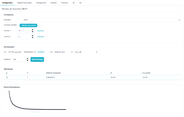
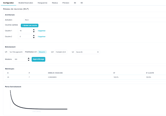
The neural network is a multilayer perceptron (MLP): the X values pass through one or more hidden layers of neurons before producing Y. The Architecture section sets the activation function (ReLU by default) and the list of hidden layers via «+ Add a layer,» followed by the number of neurons in each (here, 16 and then 8). The wider and more numerous the layers are, the more flexible the model is… and the greater the risk that it will overfit the data.
The Training section controls the learning process: LR is the learning rate (1e-2, «very aggressive,» in the example), and the LR scheduler, which causes it to decrease over the course of the iterations, Batch: the size of the mini-batches (Full-batch = the entire dataset at each step), L2: the regularization term that constrains the weights, and Iterations: the number of passes. The "Training" button starts the calculation.
The Statistics table displays n, p, the standard error, R², and adjusted R²; the Training Loss curve shows the decrease in loss (MSE) over the course of the iterations. A curve that declines and then flattens out indicates that training has converged: continuing the iterations will not yield any further improvement. A curve that is still declining at the last iteration indicates the opposite—more iterations are needed.
⚠️ In this example, R² = 100 % and the standard error is 0.00026: the network exactly replicates its 25 training lines. This is a typical sign of overfitting, not of a good model. Only the Model/Observation tab and the test lines can help you decide; if there is a discrepancy, reduce the size of the layers, increase L2 regularization, or decrease the number of iterations.
13. Possible Models with Qualitative Y-Variables
Binary Logistic Regression
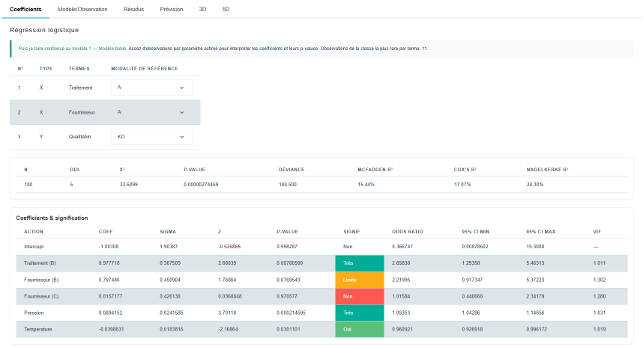
Binary logistic regression is used when Y has only two categories (here, Qualitybin: OK / KO). The model does not predict a value but rather the probability of belonging to the category under study; the Coefficients tab is therefore interpreted in the same way as that for linear regression, with a few specific indicators.
The table above sets the reference conditions: for each categorical X (Treatment, Provider) and for Y. The reference is the standard against which everything is compared; it does not appear in the table of coefficients, and changing this choice alters the interpretation of the results without changing the model. A banner reading «Can I trust the model?» also indicates whether there are enough observations in the rarest class for each estimated parameter.
The statistics row replaces the R² from the linear regression: n, ddl, the model’s χ² and its p-value (overall significance), the deviance, followed by three pseudo-R² measures—McFadden, Cox & Snell, and Nagelkerke. In the example, n = 180, χ² = 33.69 with a p-value of 2.7×10⁻⁶: the model provides useful information, even though the pseudo-R² values (ranging from 15.4 % to 24.3 %) remain modest.
The “Coefficients & Significance” table provides, for each term: the coefficient, its sigma, the z-statistic, the p-value, the significance conclusion highlighted in color, the odds ratio with its 95% confidence interval (%), and the VIF. The odds ratio is the most meaningful figure: 2.66 for Treatment (B) means that this treatment increases the odds of achieving the outcome of interest by a factor of 2.66 compared to Treatment A.
💡 An odds ratio confidence interval that includes 1 indicates «no demonstrated effect»—this is the case for Provider (C), whose interval ranges from 0.44 to 2.34. Conversely, Pressure (OR = 1.09 per unit, CI 1.04–1.15) has a weak but definite effect. As always, the quality of the classification is assessed using the confusion matrix in the Model/Observation tab, not based on pseudo-R² values.
Multinomial Logistic Regression
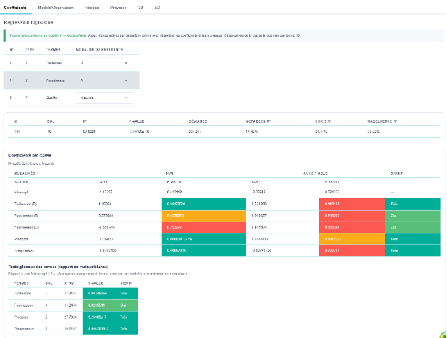
When Y has more than two categories (in this case, Quality: Poor / Good / Acceptable), Ellistat automatically switches to multinomial logistic regression. The principle remains the same, but the model estimates a set of coefficients for each category of Y, each compared to the reference category selected at the top of the page—Poor in this example.
The statistics line is read as in binary, with a higher DDL since there are more parameters: n = 180, ddl = 10, χ² = 67.94 for a p-value of 1.1×10⁻¹⁰, deviance 321.357, and pseudo-R² values of 17.45 % (McFadden), 31.44 % (Cox & Snell), and 35.52 % (Nagelkerke).
The “Coefficients by Class” table presents a coefficient/p-value pair for each value of Y. A single row may therefore be significant for one class but not for another: "Treatment (B)" significantly increases the probability of being "Good" rather than "Bad" (p = 0.0012) but not the probability of being "Acceptable" (p = 0.118). A positive coefficient increases the probability of the class in the column relative to the reference.
The «Overall Tests of Terms (Likelihood Ratio)» table answers the question missing from the previous table: "Does this factor have an effect across all classes?" Each term is assigned a unique χ² likelihood ratio and p-value—Pressure (p = 9.3×10⁻⁷) and Temperature (p = 0.0003) are highly significant, while Supplier is marginally significant (p = 0.024).
💡 The overall test is the first thing to look at when deciding whether a factor should remain in the model. The p-values by class are then used to understand where the factor has an effect. A factor can be globally significant even if none of its individual comparisons are, and the reverse is also true—which is why it’s useful to have both tables.
Decision Tree
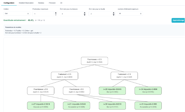
The decision tree breaks down the data through a series of binary questions about the X variables—«Supplier ≤ 0.5?», «Processing ≤ 0.5?»—until it reaches leaves, each of which carries a predicted class. It is the most readable model on the menu: each path from the root to a leaf translates directly into a workshop instruction.
The Configuration tab contains the following settings: the Splitting Criterion (Gini or entropy), the Maximum Depth, the Minimum Split Size (minimum number of individuals required for a node to be split), the Minimum Leaf Size, and the maximum number of elements. The "Train" button rebuilds the tree after each change.
The settings include Training Accuracy—the proportion of correctly classified individuals, 49.4 % for n = 180 and p = 3 in the example — followed by a summary of the actual parameters obtained: depth 4, 6 leaves, Gini criterion.
On the graph, each internal node displays its condition, depth, and impurity (imp); each leaf, shown in green, displays its size n, its impurity, and the majority class along with its probability—for example, n = 27, Bad (p = 0.5556). An impurity close to 0 indicates a pure leaf, and thus a clear rule; a high impurity indicates a leaf where the classes remain mixed, and the prediction is unreliable.
⚠️ The tree is the model that overfits the fastest: as you increase the depth, you always end up isolating each individual in its own leaf and reaching a training accuracy of 100 % without having learned anything. Increasing the min. size for the leaf and limiting the depth are the two safeguards; the confusion matrix in the Model/Observation tab, on the test lines, makes the difference.
Random Forest
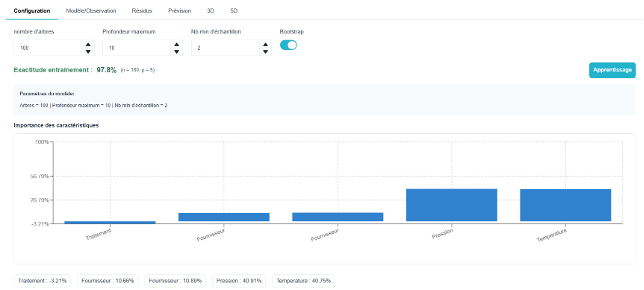
The random forest does not build a single tree but rather about a hundred, each trained on a random sample of the lines (Bootstrap option) and on a random subset of the X values. The final prediction is the majority vote of all the trees. This shuffling corrects the main flaw of the single tree—its instability—at the expense of readability: the model can no longer be interpreted as a set of rules.
The Configuration tab displays four settings: the number of trees (100 by default), the maximum depth (10), the minimum number of samples per leaf (2), and the Bootstrap toggle. Increasing the number of trees does not overfit the model—it merely stabilizes the prediction and increases computation time; it is the depth and the minimum number of samples that determine the complexity.
The header shows the training accuracy—97.8 % here for n = 180 and p = 5—followed by a summary of the selected parameters. Compare this to the 49.4 % of the single tree on the same data: the difference illustrates the gain in accuracy, but also the risk, since this accuracy is measured on the training data.
The "Importance of Characteristics" chart ranks the Xs by their contribution to the quality of the ranking, with the exact value shown below the graph: Pressure 40.91 % and Temperature 40.75 % clearly dominate; the two Supplier variables account for about 10 percent, and Processing at −3.21 % contributes nothing. For the forest, this is the equivalent of the significance table for regressions.
⚠️ A negative or near-zero significance means that the factor slightly worsens the prediction when it is swapped out: it is noise for the model. Be careful, however: importance measures predictive contribution, not causal effect, and two correlated factors share importance rather than adding it up. As with the tree, the verdict can be found in the test-row confusion matrix.
SVM – Support Vector Machine
The SVM (Support Vector Machine) seeks the boundary that best separates the classes by maximizing the margin between the boundary and the nearest points, known as support vectors. Thanks to the kernel, this boundary can be very complex in the original X space, making it a good classifier when the classes cannot be separated by a straight line.
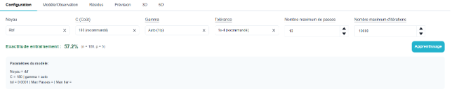
The Configuration tab contains the following settings: the Kernel (Rbf here), C (Cost), which adjusts the tolerance for classification errors—a high C value adheres closely to the data, while a low C value allows for errors to maintain a smooth boundary— Gamma, which sets the kernel’s range (Auto = 1/p), the Stop Tolerance (1e-4 recommended), the Maximum Number of Passes (10), and the Maximum Number of Iterations (10,000).
The header bar displays the training accuracy—57.2 % for n = 180 and p = 5 in the example—and the "Model Settings" box shows the configuration that was actually used: RBF kernel, C = 180, gamma = auto, tol = 0.0001.
💡 C and Gamma are adjusted together and are the only two settings that really matter. A gamma setting that is too high creates a boundary that hugs each point (over-adjustment); a C setting that is too high produces the same effect. Proceed by trial and error, monitoring the discrepancy between the training accuracy and the test lines, rather than trying to maximize the former.
⚠️ The SVM does not provide coefficients, p-values, or factor importance: it classifies without explaining. It is evaluated solely based on the confusion matrix in the Model/Observation tab. If the goal is to determine where to take action, logistic regression or a random forest provides a better answer to that question.
KNN

KNN (K-Nearest Neighbors) is the simplest of the classifiers: it does not adjust anything. To predict a new data point, it searches the dataset for the k rows that most closely resemble it and selects the class that is most common among them. The «model» is therefore the dataset itself: this explains its strength when dealing with cases it has already encountered, and its weakness as soon as it deviates from them.
The Configuration tab contains only two settings: k neighbors (5 by default) and the distance used to measure similarity: Euclidean, Manhattan, or Chebyshev. The status bar then displays the training accuracy, and the Model Settings box shows the applied configuration (k = 5, Euclidean metric).
The choice of k balances noise and smoothing: a small k fits the data closely and reacts to each individual data point, while a large k smooths the boundaries but ultimately always predicts the most frequent class. An odd k avoids ties between two classes.
⚠️ KNN is sensitive to the scale of the X variables: a factor expressed in the thousands overwhelms the others in the distance calculation. Its performance also deteriorates rapidly when there are many X variables. Like the SVM, it provides neither coefficients nor factor importance, and is evaluated solely based on the confusion matrix in the Model/Observation tab, including test rows.