


PCA summarizes several correlated quantitative variables into a small number of dimensions called main components, labeled CP1, CP2, and CP3. Each axis accounts for a portion of the total variability; the first two account for the bulk of it.
3.1 The Summary Tab
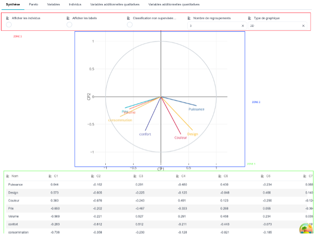
Zone 1 : display settings.
⇒ Show individuals : Overlays the scatter plot of individuals on the correlation circle.
⇒ Show labels : Write the name of each person next to their dot.
⇒ Unsupervised Classification (K-Means) : Color the individuals by family and mark the centers of each family.
⇒ Number of groups : the number of families being sought.
⇒ Chart Type : 2D or 3D. In 3D, the CP3 axis is added.
⇒ Label Positions : Appears only after you've moved a label, and lets you put everything back in place.
Zone 2 : the graph. The circle with radius 1 is the circle of correlations.
Zone 3 : Below the graph, the table of eigenvectors lists the coordinates of each variable on the axes.
💡 Labels can be moved. In 2D, click and drag a variable or category name with the mouse: this is the easiest way to separate overlapping labels. The positions are saved and will be included with the graph if you save it.
3.2 Interpreting the Correlation Circle
Each variable is an arrow extending from the origin. Its position is determined by two criteria.
Length measures the quality of representation. An arrow that almost touches the circle is well represented on the displayed plane: it can be interpreted. A short arrow, close to the center, is poorly represented on this plane — It should not be interpreted here, you need to consider the following points.
The angle between two arrows measures their correlation, provided that both are long:
⇒ two arrows side by side: positively correlated variables; ;
⇒ two opposing arrows: negatively correlated variables; ;
⇒ two arrows at 90°: independent variables.
The coordinate of a variable on an axis is its correlation with that axis. It is therefore always between −1 and 1, which explains the circle.
3.3 Reading the Cloud of Individuals
Two individuals that are close to each other on the plot are similar in terms of the variables analyzed. The center of the cloud is the origin: an individual far from the center is atypical.
⚠️ The cloud is scaled to the size of the circle to be superimposable. The distances between individuals and their directions are accurate, but their scale is not the same as that of the correlations: we see a management («This individual is moving in the direction of the pressure»), not a value.
3.4 The Pareto Tab
For each axis, it provides the equity, the explained variance and the cumulative variance, along with the corresponding scree.
This is where you decide how many axes to keep. The cumulative variance is displayed in red as long as it is less than 80 %, and in green when it exceeds that value: keep enough axes to reach the green level.
💡 Another classic guideline: keep only the axes with an eigenvalue greater than 1; an axis that explains less than a single variable does not provide a summary.
3.5 The Variables Tab
One line per variable, and four columns for each axis:
⇒ C1, C2, C3 : the correlation of the variable with the axis; ;
⇒ Contribution : the weight of the variable in the construction of the axis, expressed as a percentage. The contributions of an axis add up to 100; ;
⇒ Cos² : the quality of the variable's representation on the axis; ;
⇒ p : the probability that the observed correlation is due to chance. The value is color-coded from highly significant to not significant.
💡 To label an axis, identify the variables whose contribution is significantly higher than the average (100 / number of variables) and whose Cos² is high. They are what give the axis its meaning.
3.6 The Individuals Tab
Same logic, one line per individual: distance from the center, coordinates, contributions, and Cos².
An individual whose contribution far exceeds that of others pulls the axle all by itself : Make sure it isn't a data entry error before drawing a conclusion.
An individual's Cos² values add up to 1 across all axes. On the axes shown here, their sum therefore indicates what portion of their position is actually visible.
3.7 Additional Variables and Labels
Zone 2 The top of the screen (above the tabs) features two selectors.
Additional Variables — also known as illustrative. They are projected on the axes but do not contribute to their construction. This is a good way to compare a result with an external variable without that variable influencing the analysis.
⇒ An additional variable quantitative appears as an additional arrow in the circle, and in the «Additional Quantitative Variables» tab along with its correlation with each axis.
⇒ An additional variable qualitative place the center of mass for each category on the map: the midpoint of the individuals representing that category. The size of the symbol is proportional to the number of individuals in that category.
The «Additional Qualitative Variables» tab displays, for each modality, its distance from the center, its coordinates, its Cos², and a p-value by axis. This p-value answers the question: Does this variable distinguish between individuals along this axis? A low p-value indicates that the categories occupy distinctly different positions on the axis.
Label Identifies individuals: their marker turns the color of the selected mode, and their name is displayed if «Show Labels» is checked. This is the most direct way to see if a family pattern is emerging.
💡 Do not set a variable as both active and additional: it would construct the axis and then be evaluated on that axis, which proves nothing.