


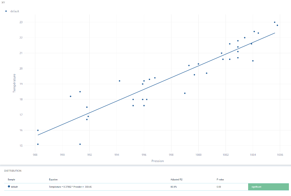
- XY Cloud : the basic graph showing the relationship between two measures, with the regression line.
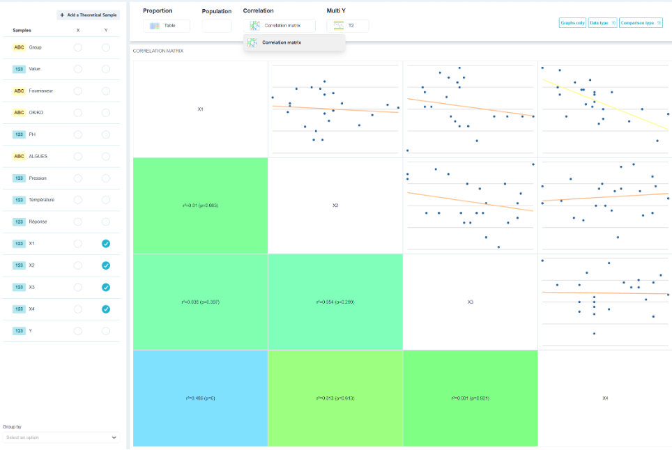
- Correlation matrix : all pairs of quantitative variables at once. This is the tabulation view when you have ten characteristics and no assumptions.
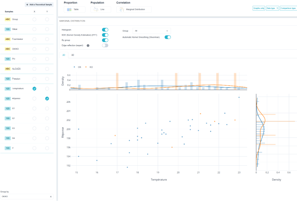
- Marginal distribution : the XY cloud, bordered by the distribution of each variable. Useful when the shape of the distributions is just as important as their relationship.
- 3D Graph : three quantitative variables in space.
⚠️ Correlation does not imply causation. Two variables can vary together because a third variable controls them: ambient temperature affects both the expansion of the room and the sensor drift. The scatter plot shows a clear relationship, and changing one will not affect the other. Only a design of experiments can establish causality.
💡 Always look at the scatter plot before trusting a correlation coefficient. A correlation of 0.9 can result from a single outlier, and a very clear bell-shaped distribution yields a coefficient close to zero. The number provides an overview; the scatter plot provides the details.