


Two methods intended to measure the same thing rarely yield exactly the same result. The question is not whether they differ—they always do—but whether the discrepancy is small enough that they can be used interchangeably: replacing one instrument with another, accepting the results from an external laboratory, or comparing a acceptance test measurement with a control measurement.
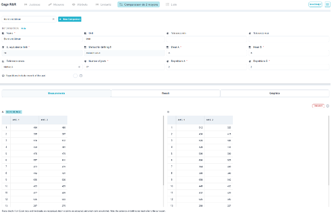
This study is neither a R&R analysis nor a test of means. A test comparing means seeks to demonstrate a difference; here, the opposite is true—we must demonstrate equivalence, and a non-significant test is not sufficient to draw a conclusion. The screen therefore addresses five distinct questions, since two means can differ in five different ways.
1. What You Need to Know
The "Information" section includes everything that defines the study:
- the name of the study, the unit, and the minimum and maximum tolerances for the characteristic—these are optional, but their absence prevents the study from undergoing the most concrete verification: that of the consistency of compliance decisions; ;
- d, the equivalence limit: the margin below which the difference between the two means has no practical significance. This is the decisive parameter of the study; ;
- the method for defining δ: in absolute terms, or relative to the tolerance or the measured quantity; ;
- the names of the two methods (A and B) and the designation of the one used as a reference; the deviation is always calculated relative to that method; ;
- the number of parts and the number of repetitions for each element; ;
- The "Rehearsals include a restaging of the play" checkbox: Check this box if, between two rehearsals, the set is taken down and rebuilt.
⚠️ δ is set before looking at the data. Choosing it after seeing the observed difference amounts to deciding on the conclusion rather than simply noting it. This is a professional judgment call: at what difference between the two means would your decision change?
💡 The “repeat” field is not just an administrative detail. Taking two consecutive measurements without disassembling the part only measures the repeatability of the display, not that of the assembly: repeatability is then underestimated, the acceptance limits are too narrow, and there is a risk of concluding that there is agreement when there isn’t. The screen displays this warning automatically when the box is not checked.
2. "Measurements" tab
Two tables side by side, one per method, one row per part, and one column per repetition. The reference method is indicated by a badge. The data entry rule is the only strict constraint: the same row must refer to the same part in both tables; otherwise, the calculated difference has no meaning.
Data can be pasted directly from Excel; tabs and line breaks are recognized, the decimal point is accepted, and empty cells are allowed.
3. Results tab: the five questions
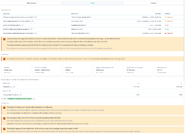
The diagnostic chart lists the five questions that need to be answered Accept to report two interchangeable options. Each is assigned an indicator, a numerical reading with its confidence interval, and a response: yes, no, or undecided.
| Question | Indicator | What it detects |
| Do the two averages yield the same value, up to δ? | TOST on the average deviation, 90% CI % | A systematic bias between the two methods. |
| Is the difference independent of the measured level? | Deming Hill, IC 95 % | A gap that forms at the lower or upper end of the range: the means coincide in the middle and diverge at the extremes. |
| 95 %: Do any parts fall within ±δ? | Acceptance limits relative to ±δ | An equivalence that is true on average but false when considered piece by piece. |
| Do the two methods have comparable repeatability? | Variance Report, 95% CI 1Q-3Q | One method is significantly more scattered than the other. |
| Did the gap remain stable during the campaign? | Trend in the entry order, 95% CI % | A deviation in one of the two parameters over the course of the measurements. |
💡 “Undecided” is not the same thing. It’s the most common response in a short campaign, and it means there isn’t enough data to make a decision. The screen doesn’t just state this—it tells you how many more items you’d need to add to have an 80 % chance of closing the deal—in this example, 416 more items, for a total of 433. This is sizing information that you should know before launching the campaign, rather than after.
4. Quantitative Indicators
Below the diagnoses, a row of thumbnails shows the key values:
- the average bias—and especially its δ component—in the example, 6.029 l/min, or 60 % of the equivalence limit: the deviation is not prohibitive, but it already consumes two-thirds of the budget; ;
- the 90% % confidence interval for the difference, compared to the ±δ band: equivalence is demonstrated when the interval lies entirely within the band; ;
- Deming's slope and its confidence interval. Unlike classical regression, Deming regression acknowledges that both means are subject to error; this is the case here—neither is a true value; ;
- the estimated bias at the lower and upper ends of the range. Two numbers with opposite signs indicate a pivot: the means intersect in the middle of the range; ;
- the number of parts outside the tolerance band ±δ—12 out of 17 in the example—which is the real message of this study.
5. The repeatability of the two methods
A separate section provides, for each of the two methods, its repeatability s_r, the portion of the tolerance interval it occupies when tolerances are specified, and the average number of repetitions used. The ratio λ of the two variances is indicated, along with its origin: estimated from the repetitions, or specified.
This section often explains the rest of the screen. Two methods with significantly different repeatability cannot be considered interchangeable even if their averages are the same: the one with greater variation will yield different conformity judgments on the same parts.
6. The Diagnosis in Plain Language
At the bottom of the tab, each criterion that has not been met or for which a decision has not been made is accompanied by a paragraph explaining what is happening and what needs to be done. This is the section you should read first: it translates the confidence intervals into decisions.
- The warnings pertain to the protocol: rehearsals that do not replicate the experimental setup, lack of tolerances, and insufficient sample size. They partially invalidate the conclusions and must be addressed before drawing conclusions.
- The diagnostic checks focus on the results: demonstrated bias, acceptance limits wider than δ, or drift during the campaign. Each is accompanied by its practical implication; for example, adjusting the mean deviation will not be sufficient if the individual variance remains too high.
⚠️ The fact that the averages are equivalent does not mean that the tools can be swapped on a part-by-part basis. If the decision on compliance is made on a part-by-part basis, the third criterion—95% of the parts within ±δ—is the determining factor, and the dispersion must be reduced before swapping the two means.
7. Charts Tab
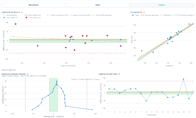
There are four charts, and each one answers one of the questions in the diagnostic table.
- Deviation from the reference—the Bland-Altman plot. The x-axis shows the reference mean, and the y-axis shows the difference between the two means. At a glance, you can see the mean deviation, the acceptance limits, the ±δ band, and the trend of the deviation. Data points outside the band are marked with a distinct symbol: their number answers the question of “piece-by-piece” variation.
- B as a function of A: the cloud of measurement pairs, the identity line y = x, the Deming regression line, and the acceptance band. A scatter plot that follows the identity line and lies within the acceptance band indicates interchangeability; a Deming line that is sloped relative to the identity line indicates a level-dependent disagreement.
- The mountain plot: the distribution of deviations, displayed as a folded percentile plot. The peak indicates the median of the deviations, the width indicates the spread, and the symmetry provides information about the presence of a bias. This is the most intuitive way to assess whether the deviations are centered and clustered, or scattered and skewed.
- Deviations in the order of recording: the same difference, plotted in the order in which the measurements were taken. This is the only graph that can reveal drift: a deviation that grows steadily over the course of the campaign is not a bias; it is a sign that the instrument is shifting.
Conclusion
The two approaches are interchangeable when all five questions are answered in the affirmative. Otherwise, the course of action depends on which question is answered in the negative:
- A demonstrated and stable average bias is corrected: this is an offset, which is adjusted through calibration or by applying a correction to one of the two averages; ;
- A discrepancy that depends on the measured level cannot be corrected by an offset: either the common range of use must be restricted, or the two methods must be treated as non-substitutable; ;
- Acceptance limits wider than δ require that the dispersion be reduced before any exchange takes place—it is the repeatability of the most dispersed mean that must be improved; ;
- Any deviation during the campaign invalidates the study itself: it must be repeated after the relevant medium has been stabilized; ;
- A draw is not a failure; it's simply a lack of pieces. The screen displays the required number of pieces.
💡 This study complements the R&R; it does not replace it. The R&R characterizes a method in absolute terms, relative to a tolerance or process variation. Comparing two methods evaluates their interchangeability: it does not say whether the methods are good, but rather whether they agree with each other. Two mediocre methods may be perfectly interchangeable, while two excellent methods may not be.