


- Histogram : the shape of the distribution. Skewness, dispersion, bimodality: a double peak almost always indicates a mixture of two populations.
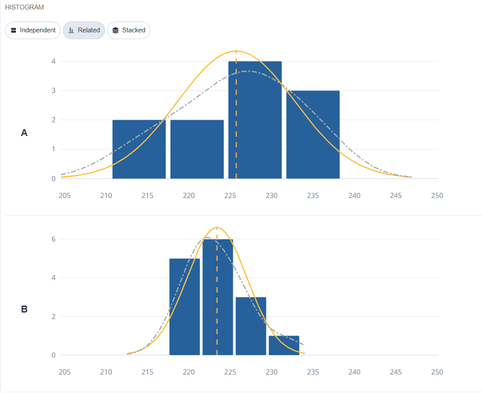
You can choose whether to have an independent X-axis for each histogram, the same X-axis for all histograms, or all histograms stacked.
- Moustache Box : the median, the quartiles, the range. This is a representation of the comparison : Several boxes side by side can be read at a glance, whereas multiple histograms get in the way.
- Line : the values in the order in which they were collected. The chronology that the histogram ignores.
- Control Chart : the line, with its control limits and detection rules.
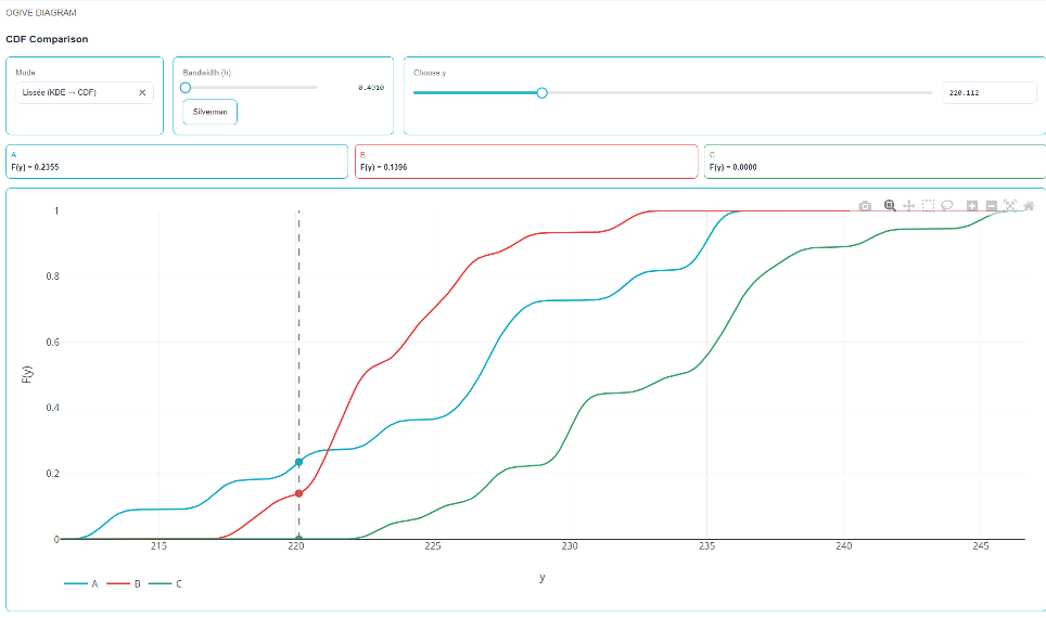
- Ogive Diagram : the cumulative distribution. This directly answers the question, «What proportion is below a given value?».
- Better Than Current : performs a nonparametric comparison of two or more modalities
- ROC Curve : evaluates the ability of a quantitative measure to distinguish between two categories and provides the optimal threshold.
💡 A histogram and a box-and-whisker plot do not answer the same question. A histogram provides a detailed description of a population; a box plot compares multiple populations. When examining two groups, start with the box plots, then open the histogram for the group in question.
⚠️ Paired data. If your two sets of data are two measurements of the same parts—before and after treatment—or two instruments used on the same samples, you must indicate this in the «Comparison Type» field. The paired test is much more powerful because it eliminates variability between samples. Treating paired data as independent often leads to the conclusion that «there is no difference» when in fact there is a clear difference.
The ROC Curve in Practice
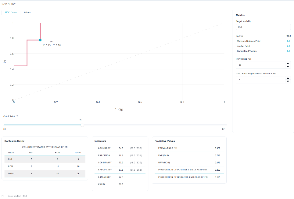
She answers: Does this measure help us make a decision?
For example, can a vibration reading be used to distinguish between bearings that will fail and those that will hold up?
- The further the curve deviates from the diagonal toward the upper-left corner, the better the separation; ;
- The’area under the curve (AUC) summarizes this power with a single number: 0.5 means «no better than chance,» and 1 means a perfect separation; ;
- The proposed threshold balances the two types of errors: missing a defect and rejecting a good part.
💡 The right threshold depends on the cost between the two errors, which is rarely symmetrical. The statistically optimal threshold is not always the economically optimal threshold: it’s up to you to adjust it with full knowledge of the facts.